Background-Independent CSS Bars
Have you ever wanted or needed to do something like this?

Typical Background-Dependent Solution
This is probably the most common heading (or other text block) bars solution which I believe you have used at least a couple of times in your projects. Here's how this typical situation usually goes in code:
HTML
<div>
  <h1>
    <span>
      Heading Bars
    </span>
  </h1>
</div>
CSS
div {
  background-color: #fff;
}

h1 {
  background-color: #000;
}

span {
  background-color: #fff; /* the same as div's */
  padding: 0 10px;
}
Obviously, the code is only effective when you have a solid color in the background. Moreover, you are relatively limited on the appearance of a bar. And yes, extra inner HTML (<span>) is evil if you care about the semantics. But what if you want to push an image or a gradient in the background?
Background-Independent Model
Great, now let's transform the code above into this:
HTML
<div>
  <h1>
    Heading Bars
  </h1>
</div>
CSS
div {
  background-image: url('wallpaper.jpg');
}

h1 {
  position: relative;
  padding: 0 26%;
}

h1::before,
h1::after {
  width: 25%;
  background-color: rgba(0, 0, 0, .5);
  content: '';
  position: absolute;
  top: 0;
  bottom: 0;
}
CSS pseudo-element ::before stands for the left and ::after for the right bar. To better understand the model, have a look at the scheme below:
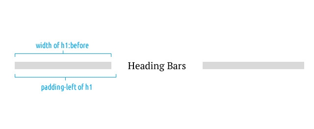
As you see, subtraction of pseudo-element's width and element's horizontal padding (left or right) is a minimal gap between the bar and the content. Keep padding greater than width to make sure the gap does not overlap the content.
Demo
Summarize
- Independence of the background;
- Highly customizable appearance;
- Perfectly works in responsive environments.
Because there's no smoke without fire, the model may have a disadvantage in some situations if compared to background-dependent solution. It's a non-persistent gap between content and bars. The wider heading, the wider gap.
Browser Support
How the model works in different browsers depends only on how they do support ::before and ::after pseudo-elements. Everything goes fine in recent modern browsers, however, it would collapse in IE7 and down. Luckily, there is a great JavaScript fallback (used in demo) written by a very good people – IE7.js.
The Last Bit
Before discovering this method, I found Chris Coyier's Full Browser Width Bars which may also appear to be useful for you.