Keeping CSS short with currentColor
Turns out currentColor has been here for quite some time now, but I heard about it only a few months ago when I read Dudley Storey’s post. He states that it is supported very well across the browsers (IE9+). This was enough for me to start using it in production. I was quite surprised how useful the keyword is: it helps to keep CSS code shorter and smarter.
Before diving into practical usage examples, here is a short theory course. This is how MDN describes currentColor:
The
currentColorkeyword represents the calculated value of the element’scolorproperty. It allows to make the color properties inherited by properties or child's element properties that do not inherit it by default.
SVG
This is my favorite. Take a very common example on the Web – a button with SVG icon and a title in it. I have these here on my website too:
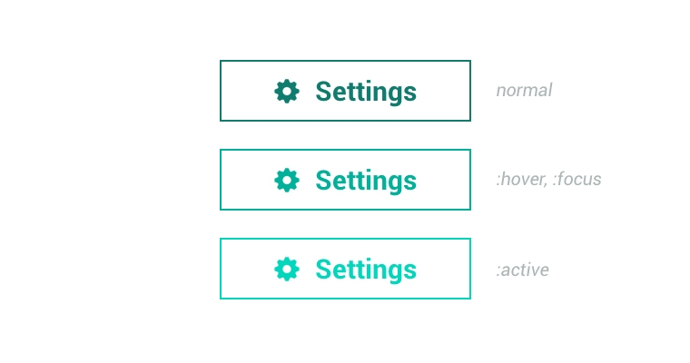
Of course, you are a very responsible web designer, and you style :hover, :focus, :active states of the button for a better interaction with a user. This is how your code usually looks like:
.button  {
	color: #000;
	border: 2px solid #000;
}

.button:hover,
.button:focus {
	color: #333;
	border-color: #333;
}

.button:active {
	color: #666;
	border-color: #666;
}

.button svg {
  fill: #000;
}

.button:hover svg,
.button:focus svg {
  fill: #333;
}

.button:active svg {
  fill: #666;
}
Currently I am writing a front-end code for client’s e-commerce website which has a few different button designs. Moreover, there are anchors that have :visited state styled in addition. And there are many more similar SVG usage cases (toolbars, etc.) where SVG has to have the color of the text. currentColor helps to reduce the code twice:
/* put this in your reset-normalize-defaults.css file */

svg {
	fill: currentColor;
}

/* now you don't have to style SVG and border-color at all */

.button {
	color: #000;
	border: 2px solid currentColor;
}

.button:hover,
.button:focus {
	color: #333;
}

.button:active {
	color: #666;
}
Gradients
The keyword can be used anywhere where the value is the definition of the color, including gradients. In my previous post I talked a little about how I implemented that trendy hyperlink underlining:

Usual CSS equivalent including interactive states:
a {
	text-shadow: 2px 0 0 #fff, -2px 0 0 #fff;
	color: #000;
	background-image: -webkit-linear-gradient( left, #000 0%, #000 100% );
	background-image: linear-gradient( to right, #000 0%, #000 100% );
	background-repeat: repeat-x;
	background-position: 0 95%;
	-webkit-background-size: 100% 1px;
	background-size: 100% 1px;
}

a:hover,
a:focus {
	color: #333;
	background-image: -webkit-linear-gradient( left, #333 0%, #333 100% );
	background-image: linear-gradient( to right, #333 0%, #333 100% );
}

a:focus {
	color: #666;
	background-image: -webkit-linear-gradient( left, #666 0%, #666 100% );
	background-image: linear-gradient( to right, #666 0%, #666 100% );
}

a:visited {
	color: #999;
	background-image: -webkit-linear-gradient( left, #999 0%, #999 100% );
	background-image: linear-gradient( to right, #999 0%, #999 100% );
}
background-image is responsible for the underline and it has the same color as the text. The code looks massive. Nevertheless, you usually do not limit yourself to one link color. In my personal experience there are at least three of them: general link color, grey, and white (when on dark background). This means 3x more of the code. But currentColor does the magic again:
a {
	text-shadow: 2px 0 0 #fff, -2px 0 0 #fff;
	color: #000;
	background-image: -webkit-linear-gradient( left, currentColor 0%, currentColor 100% );
	background-image: linear-gradient( to right, currentColor 0%, currentColor 100% );
	background-repeat: repeat-x;
	background-position: 0 95%;
	-webkit-background-size: 100% 1px;
	background-size: 100% 1px;
}

a:hover,
a:focus		{ color: #333; }
a:focus		{ color: #666; }
a:visited	{ color: #999; }

/* grey links */

.grey-links a			    { color: #999; }
.grey-links a:hover,
.grey-links a:focus		{ color: #666; }
.grey-links a:active	{ color: #333; }
Pseudo-elements
I believe you are familiar with CSS triangles and have used them many times. Me too, and very often I use them to enrich the link styling, like this:

CSS pseudo-element ::after is a triangle in this case. By using currentColor you don’t have to repeat color settings for the triangle and its interaction states:
a			    { color: #000; }
a:hover,
a:focus		{ color: #333; }
a:active	{ color: #666; }

a::after {
  width: 0;
  height: 0;
  border: 0.5em solid transparent;
  border-right: none;
  content: '';
  display: inline-block;
}

a::after,
a:hover::after,
a:focus::after,
a:active::after {
  border-left-color: currentColor;
}
Horizontal line
This isn’t an example of writing less code. It’s more like an example of writing efficient and maintainable code. The purpose of the horizontal line, the <hr />, is to divide different parts of the content. I think that visually the line shouldn’t be disturbing, it should be subtle:
Dudley has already mentioned this among his examples, so I’m just repeating this and adding a little tweak:
.post {
	color: #000;
}

.post hr {
  width: 33%;
  height: 0.313em; /* 5px */
  border: none;
  background-color: currentColor;
  opacity: .2;
}
The smart thing about this code is that if you ever change the color of the text, you will not need to change the color of the horizontal line. Automation is what we always seek in our work. The more code we write, the more we value the automation solutions.
Before I go…
Have any more practical and code-saving usages of currentColor? Be sure to share them.