Responsive Equal Height Blocks
Update: after publishing this post I received some useful feedback from the community and wrote a new post with much smarter solution to the problem. I recommend you reading Flexbox Based Responsive Equal Height Blocks With JavaScript Fallback instead._
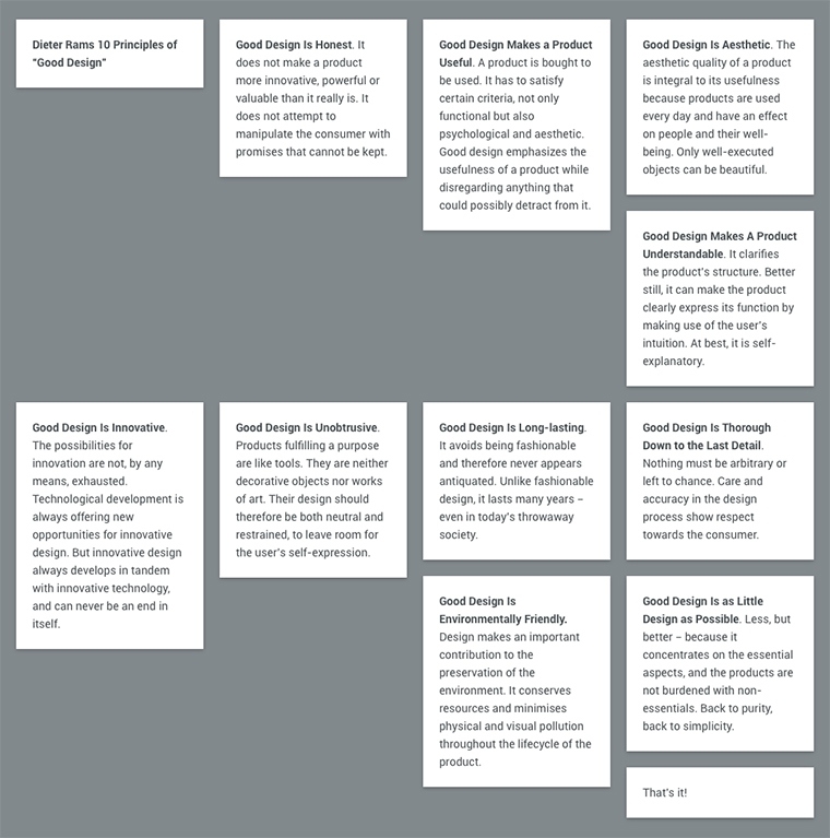
When I was designing Readerrr’s features page, I wanted to put the features list content in a semantic markup, i.e. <ul>, <li>, and to have two list items per row on larger screens as well as one item per row on narrower screens. Each item has a different unknown amount of content which means every list item has a different height. Therefore, when you float them next to each other, you naturally get the layout which looks kinda broken, like this:

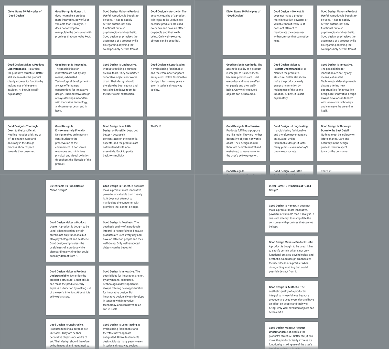
This could be fixed by virtually dividing the list into rows, picking the height of the highest item in each row, and setting it for the other corresponding row items. Most importantly, this should be done in a responsive way:

Basic layout
Let’s start from where we began by constructing the “problematic” layout:
<ul class="list">
	<li class="list__item"><!-- content --></li>
	<li class="list__item"><!-- content --></li>
	<!-- other items -->
</ul>
In my example I’ll initially have 4 items (100% ÷ 4 = 25%) per row:
.list {
	overflow: hidden; /* just clearing floats */
}

.list__item {
  width: 25%; /* 4 items per row */
  float: left;
}
As I mentioned and showed previously, this code produces the layout which looks broken.
Responsive equal heights
Before controlling the heights, let’s set the number of blocks per row for smaller screens with the help of CSS media queries:
@media screen and (max-width: 50em) /* 800px */ {
	.list__item {
		width: 33.333%; /* 3 items per row */
	}
}

@media screen and (max-width: 40em) /* 640px */ {
	.list__item {
		width: 50%;  /* 2 items per row */
	}
}

@media screen and (max-width: 20em) /* 320px */ {
	.list__item {
		width: 100%;  /* 1 item per row */
		float: none;
	}
}
I wrote a tiny piece of jQuery-dependent code which:
- Calculates the number of items per row by dividing the widths of
.listand.list__item; - Virtually divides the list into rows accordingly to that number;
- Detects which item has the biggest height in each row;
- Sets these heights for other items in each row correspondingly.
These steps are performed once when the page loads and repeated every time the browser’s window resizes.
;(function($, window, document, undefined)
{
	'use strict';

	var $list = $('.list'),
		  $items = $list.find('.list__item'),
		  setHeights = function() {
        $items.css('height', 'auto');

        var perRow = Math.floor($list.width() / $items.width());
        if(perRow == null || perRow < 2) return true;

        for(var i = 0, j = $items.length; i < j; i += perRow) {
          var maxHeight	= 0,
              $row = $items.slice(i, i + perRow);

          $row.each(function() {
            var itemHeight = parseInt($(this).outerHeight());
            if (itemHeight > maxHeight) maxHeight = itemHeight;
          });
          $row.css('height', maxHeight);
        }
      };

	setHeights();
	$(window).on('resize', setHeights);

})( jQuery, window, document );
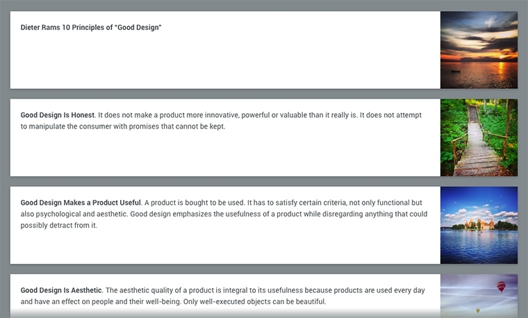
What if there are images in the blocks?
This part is not relevant if there are widths and heights defined for images in HTML or CSS. However, here’s what will happen if the exact dimensions of images are unknown:

The way out is to repeat these four mighty steps by calling the respective function within each image load. This serves fine if you have just a few blocks and lightweight images.
// ...
setHeights();
$(window).on('resize', setHeights);
$list.find('img').on('load', setHeights); // the trick!

However, if you are about to build a huge gallery or some kind of masonry with a lot of heavyweight images, this would not work well because of the constant visual content overlaps and “jumps” while images are being downloaded. I suggest loading the images manually and building the layout block by block.
To start with, let’s put each image tag into <noscript></noscript>. These images will not be loaded by the browser if JavaScript is enabled. Luckily, they will remain accessible for search engines and will be loaded if JavaScript is disabled!
<li class="list__item">
	<figure>
		<noscript class="list__item__image"><img src="img.jpg" alt="" /></noscript>
		<figcaption>Text</figcaption>
	</figure>
</li>
Now hide the blocks with some CSS and, if you prefer, define the transition for opacity for animated block fade-in:
.list__item {
	opacity: 0;
	-webkit-transition: opacity .5s linear;
	transition: opacity .5s linear;
}
One more tiny piece of jQuery-dependent code recursively replaces all the noscript’s with their child img’s, loads them, and fades in their parent blocks one after another.
var loadImages = function() {
	$items.filter('.js-load-images:first').each(function() {
		var $this		= $( this ),
        $imgs		  = $this.find('noscript.list__item__image'),
        imgTotal	= $imgs.length,
        imgLoaded	= 0;

		$imgs.each( function() {
			var $noscript	= $(this),
				  $img		  = $($noscript.text());

			$img.load(function() {
				$noscript.replaceWith($img);
				imgLoaded++;
				if(imgLoaded >= imgTotal) {
					$this.css('opacity', 1);
					setHeights();
					loadImages();
				}
			});
		});
	});
};

$items.addClass('js-load-images');
loadImages();
What if JavaScript is disabled?
Graceful degradation using CSS! In order to check whether JavaScript is enabled or disabled via CSS, append a class name no-js to html tag and remove it using JavaScript (you can skip the script part if you are using Modernizr in the document). Naturally, the class name will not be removed if JavaScript is disabled.
<html class="no-js">
	<head>
		<!-- your stuff -->
		<script>(function(e,t,n){var r=e.querySelectorAll("html")[0];r.className=r.className.replace(/(^|\s)no-js(\s|$)/,"$1$2")})(document,window,0);</script>
	</head>
	<!-- your stuff -->
</html>
Now you can easily modify the blocks for no-JavaScript case. I chose to present the blocks as full-width rows. If there are any images, they will be aligned by the right edge of the row on larger screens:
html.no-js .list__item {
	width: 100%;
	float: none;
}

html.no-js .list__item img {
  max-width: 9.375em; /* 150px */
  float: right;
  margin-left: 1.25em; /* 20px */
}

@media screen and (max-width: 20em) /* 320px */ {
	html.no-js .list__item img {
		max-width: none;
		float: none;
		margin-left: 0;
	}
}

Demo
Three types of examples for you to try and investigate: