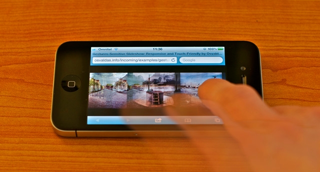
Gestures-Sensitive Slideshow: Responsive and Touch-Friendly
I'm not quite sure, but it was probably 2006 (correct me if I'm wrong) when with the birth of jQuery the very first non-Flash slideshows/sliders appeared on Web. Before that time, writing JavaScript was a horrible pain and therefore websites were boring, Internet wasn't that attractive as it is nowadays. Because nobody wanted to spend a week writing a thousand-lines code just to have something that does not work properly on any browser! Luckily, things have changed: JavaScript had become practical and that had heavily influenced the whole craft. Now things have changed even more: you can't ignore mobile & tablet devices, you must have your content accessible on any modern device.
The Problem
While working on a client project, I wanted to present interior portfolio in appealing and more appropriate way than what usually resides under the slideshow term. Not to mention accessibility on touch devices. So I thought: after all, moving mouse or sliding finger on screen is much easier than clicking or tapping arrows for dozens of times, right? Voila!
The Solution
The technique is based on some lines of HTML, CSS, JavaScript and (whole) jQuery framework. Unlike responsive and touch-friendly tooltip, I made it plugin-like so that you can call plenty of the slideshow instances from wherever you want.
Notice that the slideshow is returning what means anchors do not perform their primary function on touch devices. Consequently, this type of slideshow may not fit in every situation. Anyway, if you have a specific purpose, as it is in my case, the technique should serve well.
HTML
The structure couldn't be simpler: container and unordered list. What about content? It's totally up to your imagination: it could be anything from pure images to tables. An example with images:
<div id="slideshow">
  <ul>
    <li><img src="1.jpg" alt="" /></li>
    <li><img src="2.jpg" alt="" /></li>
    <li><img src="3.jpg" alt="" /></li>
    <li><img src="4.jpg" alt="" /></li>
    <li><img src="5.jpg" alt="" /></li>
  </ul>
</div>
CSS
I think you have just felt what the CSS code is like only by looking at the HTML above, but just in case, here's what to start with:
#slideshow {
  width: 100%;
  height: 500px; /* slideshow height */
  overflow: hidden;
  position: relative; /* or absolute, but not static */
}

#slideshow ul {
  width: 9999%;
  height: 100%;
  position: absolute;
  top: 0;
  left: 0;
}

#slideshow li {
  height: 100%;
  float: left;
  margin: 0 20px; /* spacing between items */
}
JavaScript
The plugin, actually, is very tiny, however, it has too many lines to paste them here. Paradox. So I made gestured-slideshow.js available in the next tab of your browser.
There's no surprise you can call slideshow instance(s) in this way:
$( '#slideshow' ).gesturedSlideshow();Captions, shadows, rounded borders, gradients, textures, animations and other loud phrases, for sure, are the way to style your next slideshow, but I decided to keep my demo calm and technique-focused.