Imitating calc() Fallback or Fixed-Width Sidebar In Responsive Layout
Dealing with CSS browser compatibility and solving technical issues is probably the real charm (I mean it) of front-end development. None of the projects do without it. Working on one of those I finally had my first experience with CSS function calc():
With calc(), you can perform calculations to determine CSS property values.
I know that you know this, and I also know that you have already seen these examples and have even tried them at home:
div {
  width: calc(100% - 2.5em);
  background-position: calc(50% + 50px);
  margin: calc(1.25rem - 5px);
}
As you see, calc() takes writing CSS to much higher level. It is so powerful that front-enders have no idea what to do with it yet. And with the recent appearance of KitKat (Android 4.4) the function has become supported in all major browsers (sorry 3rd brother, Opera Mini). Start using it, wisely.
Situation
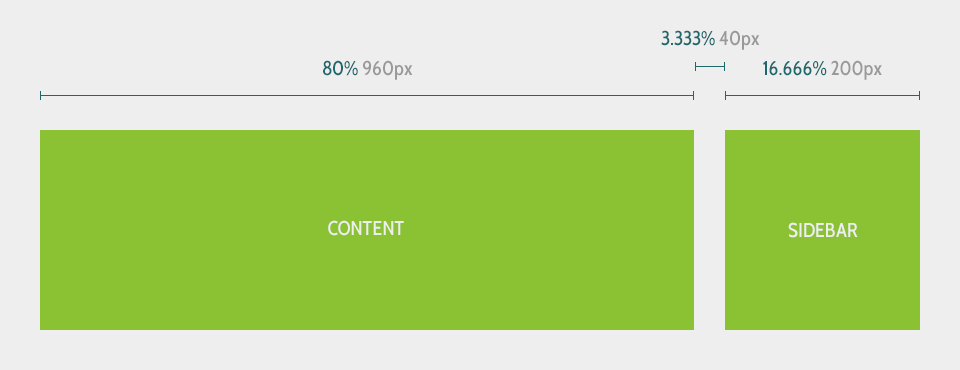
Imagine this painfully standard situation: content and sidebar areas floated side by side, separated by gap:
Usually you have two div’s wrapped into one and styled:
<div class="container">
  <div class="content">Content</div>
  <div class="sidebar">Sidebar</div>
</div>
.container,
.content,
.sidebar {
box-sizing: border-box;
}
.container {
width: 100%;
max-width: 80em; /* 1280 */
padding: 2.5em; /* 40 */
}
.content {
width: 80%; /* 960 */
float: left;
}
.sidebar {
width: 16.666%; /* 200 */
float: right;
}
@media only screen and (max-width: 40em) /* 640 */ {
.content,
.sidebar {
width: 100%;
float: none;
}
.sidebar {
margin-top: 1.25em; /* 20 */
}
}Looks like a perfectly responsive layout and there is nothing left to add, however…
Problem

The layout I worked on had quite a small initial width of the sidebar and a wide content area. Therefore, when resizing down the viewport, the sidebar becomes extremely tight very quickly. What to do when the sidebar gets too narrow and moving it under the content is yet too early?
Solution

It is a fixed-width sidebar, calc(), and a fallback for browsers that do not support this function. A minor modification of CSS classes .content and .sidebar brings these three bolds to life:
.content {
  width: 80%; /* 960 */
  width: calc(100% - 15em); /* 240 */
  float: left;
}

.sidebar {
  width: 16.666%; /* 200 */
  width: calc(12.5em); /* 200 */
  float: right;
}
If you were attentive you should see that the line width: calc(12.5em) is the trick here. Why? Let’s see all these widths like in pairs – exactly what we need browsers to do.
The first pair is width: 80% (content) and width: 16.666% (sidebar) that does the job in calc() incompatible browsers, which will just ignore calc(). It is the callback (backup). It means that the minority of website visitors will see narrower sidebar on narrower viewports. And that should be perfectly fine for people using older browser versions.
The second: width: calc(100% - 15em) and width: calc(12.5em). This is for newer browser versions which will override the previous width definitions. There are a couple of things to explain:
- Content:
calc(100% - 15em)= 100% - sidebar width - gap width. Besides that this calculates the width of the content element, it also assures that the gap between the sidebar and content is always equal to2.5em(40px). Total win for perfectionists. - Sidebar:
calc(12.5em)– who said that you need to calculate something between the brackets. This little trick cheats browsers into seeing width properties in pairs and using the only understandable one for them. I called this “imitating calc() fallback”, but actually it is vice versa. Um…
Party… Demo time! I made a button to imitate calc() support, you may want to try it:
One more thing
Just like many other CSS features, calc() was an experimental one and only available under the vendor prefixes some time ago. So let’s get the maximum of it:
.content {
  width: 80%; /* 960 */
  width: -webkit-calc(100% - 15em); /* 240 */
  width: -moz-calc(100% - 15em); /* 240 */
  width: calc(100% - 15em); /* 240 */
  float: left;
}

.sidebar {
  width: 16.666%; /* 200 */
  width: -webkit-calc(12.5em); /* 200 */
  width: -moz-calc(12.5em); /* 200 */
  width: calc(12.5em); /* 200 */
  float: right;
}
There is a way to do without calc(), and that is by taking the advantage of CSS property position. However, the whole layout would fail (which you do not want) if the sidebar was higher than the content area.