Redesign
After almost three years I have finally arrived at the point where I had to redesign my personal website. I was forced by a few reasons.
The first one is that I had this huge image on the homepage for the newest blog post. It was okay as long as I had something unique to show, preferably my own creation. But what if I wanted to write a short post, a comment, for example, which has no relation to any unique graphics? Stock images – no, thank you. I wanted to lose this dependency.
The second reason is the ad by AdPacks. I wanted to have it on every page of my website. Web design audience does not conflict with real, useful web design related ads. That’s one more reason to keep sharing web design techniques.
Lastly, there were many small details which I was mad about and I knew I needed to eliminate these evils. Realignment just wouldn’t have worked out, so I put my the previous design under v2.osvaldas.info and came up with this…
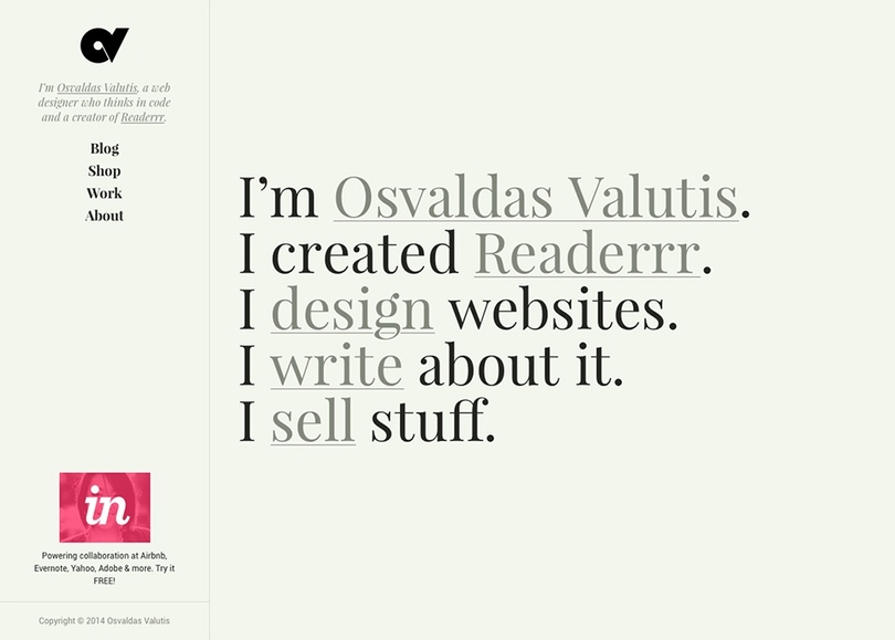
The feel
I wanted a different mood for the website. A more personal and authentic feel, rather than white-color-dominating and sales-first design. I chose the background color similar to the color of my Moleskine notebook pages’ and a typace from Serif fonts family.
Browsing through Google Fonts the typeface named Playfair Display quickly took my attention. It’s extremely good looking for large text but not so appealing for smaller sentences and paragraphs. For the later cases I am using Google’s famous Roboto. I’ve been struggling a lot to find a readable typeface and Roboto seemed to be a good way out.
Layout
Reading text is much easier when the content block is centered on the page because your face is naturally centered in relation to the screen. Despite the sidebar, the layout is centered in relation to the content block rather than the whole layout. Most of the time this helps to keep the content block centered. Try resizing the window to see how the layout behaves.
On smaller screens the sidebar is transformed to a header-like element of the website, which auto hides when scrolling down in order to give more room for content.
Buttons
Quickly after Google introduced their new design language, front-enders created a button-click effect technique equivalent for web. It’s a nice effect, but it uses JavaScript and some extra markup which is why I think implementing is not reasonable. I wanted something similar but with a lighter implementation. Thank you, pseudo elements and CSS animation. I am going to share the code in one of my future blog posts. Inspired by Google’s Material Design and interpreted by me:
Links
I was skeptical about this CSS gradients based technique when I first saw it, because it requires text shadow. Although, that is not a problem if you have a solid color background behind the links, which is exactly my case. Finally, David’s implementation persuaded me to try this out.
Beauty demands victims. The bad thing about this technique is that you have to define few properties: you have to know the background color behind the link, and you have to know the color of the link. I found a trick that basically eliminates that last flaw – it’s a CSS variable currentColor. There are many more cases where it saves me lines of CSS and which I am going to document later.
With the help of Modernizr I target browsers that do not support CSS gradients and browsers which have JavaScript disabled (because Modernizr will not function and most likely they do not support gradients as well) for fallback:
html.no-js a,
html.no-cssgradients a {
	text-decoration: underline;
}

html.cssgradients a {
	text-shadow: 2px 0 0 #f2f6ed, -2px 0 0 #f2f6ed;
	background-image: linear-gradient( to right, currentColor 0%, currentColor 100% );
	background-repeat: repeat-x;
	background-position: 0 95%;
	-webkit-background-size: 100% 1px;
	background-size: 100% 1px;
}
Responsive images
Native responsive images technique ([scrset] and <picture>) is making just the first steps – the browser compatibility is very low. Picturefill polyfil fails when JavaScript is disabled – no images will be displayed and crawled by search engines. I ended up writing my own polyfil. The technique is based on the usage of <noscript> tag and has four main features:
- Images are displayed even if JavaScript is disabled;
- Images are reachable by search engines. Nick Power did a test to find out if the contents of
<noscript>are crawled by search engines. The result was positive; - Images are lazyloaded. Images are loaded and displayed only if user will see them. Why download these megabytes if the user is not going to scroll down the page?
- Finally and most importantly, the script picks the most appropriate image source from
data-srcsetattribute by using the the syntax of native[srcset].
Let’s have a look to what this has helped to achieve so far. Take my work page for example. There are 31 large images. The “problem” is that a user may not necessarily scroll down the page and see all the images. What if they will just click the first link and use an in-page navigation to see the rest of the works? So, the initial size of the page viewing it on 13” laptop is 1.34 mb. If a user scrolls down the page, the size increases up to 3.50 mb. Repeating the same scenario on iPhone, the numbers are respectively 0.78 mb and 2.61 mb. Mobile data users would appreciate that.
Green and resources-saving web design starts here. I am going to share the code very soon.
Fonts
99% of the time I use Google Fonts. This is a third-party service which not necessarily works smoothly all the time. In order to prevent these services from badly influencing website loading, it’s a good practice to use third-party services in a non render blocking manner – asynchronously. Thanks to Filament Group for writing and sharing a JavaScript function loadCSS. Along with no-JavaScript fallback the insertion looks this:
<noscript>
	<link rel="stylesheet" href="//fonts.googleapis.com/css?family=Roboto:400,400italic,700,700italic" />
</noscript>

<script>
	function loadCSS(e,t,n){"use strict";var r=window.document.createElement("link");var i=t||window.document.getElementsByTagName("script")[0];r.rel="stylesheet";r.href=e;r.media="only x";i.parentNode.insertBefore(r,i);setTimeout(function(){r.media=n||"all"})};
	loadCSS( '//fonts.googleapis.com/css?family=Roboto:400,400italic,700,700italic' );
</script>
However, this does not prevent from text flashing. To fix that I am going to consider two techniques: Smashing Magazine’s and Web Font Loader.
SVG icons
The only rastered graphics on this website is images. I have fully switched to good ol’ SVG, because the device screens are improving so fast that @2x is not enough today. SVG saves the time and provides huge manipulation possibilities.
Firstly, I tried encoding SVG files with Base64 and inserting them directly into CSS. However, the method has various flaws and isn’t recommended. You cannot color the images by simply using CSS property fill, neither take the advantage of viewbox and other related attributes. On some browsers (i.e. IE Mobile) the images look blurry, etc. I am still using this method on Readerrr, but that will change soon.
Finally, I stayed on Inline SVG. It is still weird for me to insert icons using HTML tags, because I have always treated icons as a decoration, not content. Anyway, I can ignore that because of the flexibility that Inline SVG gives.
I have developed a custom, still experimental way of providing the SVG icons for the document. If possible it stores icons onto browser’s localStorage. Else and if possible it loads icons asynchronously. It also guarantees that icons are displayed in both JavaScript and no-JavaScript environments, including IE 9, 10, 11. I am going share the code soon.
Performance
Besides asynchronous CSS, there is also a very similar way to load JavaScript files. Thanks again to Filament Group:
<script>
	function loadJS(e){"use strict";var t=window.document.getElementsByTagName("script")[0];var n=window.document.createElement("script");n.src=e;t.parentNode.insertBefore(n,t);return n};
	loadJS( 'file.js' );
</script>
Putting this into <head> means that downloading of the JavaScript file starts along with the downloading of the whole document. It also means that downloading of the document is not interrupted or blocked by downloading of the document. What a win.
The fewer render-blocking cases the faster the website loads. Or, which is very important, at least gives that impression to a user.
The size of the homepage is 231 kb, including AdPacks ad. 86 kb belongs to jQuery. I think the proportion is saying “go jQuery-less”…
Newsletter
I had this idea for some time now. I also had a newsletter module for my CodeIgniter based back-end system which I developed for my client. So I am double sizing the amount of options for subscribing to my news. No regular emails for now, just important news, such as big blog posts, shop items, or personal projects.