Responsive jQuery Masonry
…or Pinterest-style layout. jQuery Masonry is a jQuery-based plugin for a dynamic grid layout built by David DeSandro. What it does is “arranges elements vertically, positioning each element in the next open spot in the grid” and what you get is “minimized vertical gaps between elements of varying height”. Let’s dive into that.

Sheepy Me is a website where I constantly combine time-tested techniques and new trends. As for the blog where pictures act big in both ways, Pinterest inspired layout (a trend, popularized by Pinterest) probably was the best choice for listing items attractively. Although, JavaScript-based layout is not a good practice and should be avoided while CSS is capable to do this instead. This time, so far, it's not. Will take a look closer at this later in the post anyway.
jQuery Masonry is not the only plugin and method for achieving the same effect, but it was the one actually working as well as working in the way I prefer. In responsive way. We're at the nice times when not thinking responsively is a bad habit and non-responsive techniques are considered as, to put it mildly, poor ones. jQuery Masonry is responsive-friendly, but that's not enough and some extra work is necessary in order to make it all meaningful.
The Grid
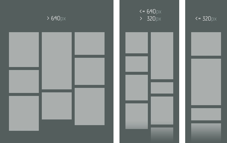
Three-column grid is when screen width is higher than 640 pixels. Two columns – when screen width is equal to or less than 640 pixels, but is more than 320 pixels. And one column – when screen width is equal to or less than 320 pixels. The scheme may be easily adjusted to any other manner.
Setting It Up
Apart from the obvious include-jQuery-first, let's see how actual things look like before bringing them to the world of responsiveness.
HTML structure is the simplest thing here. The further content goes into .item elements. Thinking of better semantics, it would be nicer to go with unordered list. At Sheepy Me I used <ul>'s for comments, date and tags to present into .item's. To avoid any conflict and keep CSS clean, div's was the only choice.
<div id="wrapper">
  <div id="list">
    <div class="item"> ... </div>
    <div class="item"> ... </div>
    <div class="item"> ... </div>
    <!-- ... -->
  </div>
</div>
CSS is a little bit more specific as it puts our layout to fluid mode. Instead of ritual px, I use em (based on browser's default size 16px, 100%) and ` to define sizes and so to achieve complete flexibility across the browsers, screen sizes and people habits.
#wrapper {
  max-width: 60em; /* 960 px */
  margin: 0 auto;
}

#list {
  width: 103.125%; /* 990px */
  overflow: hidden;
  margin-left: -1.562%; /* 15px */
  margin-bottom: -1.875em; /* 30px */
}

.item {
  width: 30.303%; /* 300px */
  float: left;
  margin: 0 1.515% 1.875em; /* 15px 30px */
}
What's interesting, I did a small workaround to solve the problem of horizontal margins by setting the width of #list to more than 100% and left margin to the negative value. Though jQuery Masonry manages horizontal spacing automatically, the workaround gracefully degrades when JavaScript is disabled in the browser.
Finally some JavaScript. Only shameless initialization of the plugin for now.
$(window).load(function() {
  $('#list').masonry({ itemSelector: '.item' });
});
Pouring In Responsiveness
Now that we have a working formation, let's teach it to adapt to savage environments: small and constantly changing screen sizes as well as zooming without remorse. However, the zoom is not handled well enough due to the absence of bulletproof active zooming detection.
HTML stays the same, but CSS code gets a makeup – media queries. The first of them transforms the grid to two-column one, whilst the second to the simple one-column layout.
#wrapper {
  max-width: 60em; /* 960 px */
  margin: 0 auto;
}

#list {
  width: 103.125%; /* 990px */
  overflow: hidden;
  margin-left: -1.562%; /* 15px */
  margin-bottom: -1.875em; /* 30px */
}

.item {
  width: 30.303%; /* 300px */
  float: left;
  margin: 0 1.515% 1.875em; /* 15px 30px */
}

@media only screen and (max-width: 40em) /* 640px */ {
  .item {
    width: 46.876%; /* 305px */
    margin-bottom: 0.938em; /* 15px */
  }
}

@media only screen and (max-width: 20em) /* 640px */ {
  #list {
    width: 100%;
    margin-left: 0;
  }

  .item {
    width: 100%;
    margin-left: 0;
    margin-right: 0;
  }
}
What's for JavaScript, function setColumns(); initially counts the number of columns accordingly to the screen width. $(window).resize(setColumns); does the same, but when window is resized. jQuery Masonry, luckily, has an option named columnWidth. Putting under (for value) a function actually solves the problem.
$(window).load(function() {
  var columns    = 3,
      setColumns = function() { columns = $(window).width() > 640 ? 3 : $(window).width() > 320 ? 2 : 1; };

  setColumns();
  $(window).resize(setColumns);

  $('#list').masonry({
    itemSelector: '.item',
    columnWidth:  function(containerWidth) { return containerWidth / columns; }
  });
});
That's it! Sheepy Me is a real life example of the whole experience. Besides that, I made a separate demo which consists only of the relevant code and helps to focus on the technique itself.
Demo
CSS-only solution?
Kushagra Agarwal suggests to do without JavaScript and use CSS's column-* properties instead. So how CSS code would change? #wrapper remains the same, but the rest:
#list {
  width: 100%;
  overflow: hidden;
  margin-bottom: -1.875em; /* 30px */
  -webkit-column-count: 3;
  -webkit-column-gap: 1.875em; /* 30px */
  -webkit-column-fill: auto;
  -moz-column-count: 3;
  -moz-column-gap: 1.875em; /* 30px */
  -moz-column-fill: auto;
  column-count: 3;
  column-gap: 1.875em; /* 30px */
  column-fill: auto;
}

.item {
  margin-bottom: 1.875em; /* 15px 30px */
  -webkit-column-break-inside: avoid;
  -moz-column-break-inside: avoid;
  column-break-inside: avoid;
}

@media only screen and (max-width: 40em) /* 640px */ {
  #list {
    -webkit-column-count: 2;
    -webkit-column-gap: 0.938em; /* 15px */
    -moz-column-count: 2;
    -moz-column-gap: 0.938em; /* 15px */
    column-count: 2;
    column-gap: 0.938em; /* 15px */
  }

  .item {
    margin-bottom: 0.938em; /* 15px */
  }
}

@media only screen and (max-width: 20em) /* 320px */ {
  #list {
    -webkit-column-count: auto;
    -moz-column-count: auto;
    column-count: auto;
  }
}
Demo
How lovely is that, even with those vendor prefixes. It would absolutely be the best technique, if it hadn't the following limitations:
- Not supported by IE9 and below;
- Different rendering among supported browsers. Safari and Chrome does in one way, whilst Firefox and Opera in another. And both manners doesn't seem to be logical enough.
Conclusion
column-* isn't fully standardized yet across web browsers. jQuery Masonry is a JavaScript thing. Two evils. You can stay with just one of them. You can combine them, by attaching jQuery Masonry only to IE9-and-below or JavaScript-less users and applying CSS columns for the rest. Whichever your decision is, just make sure it's best for your users.